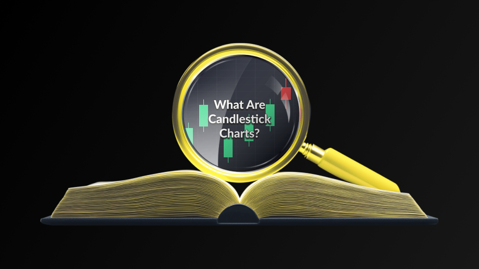
Understanding The Basics of Candlestick Charts
Candlestick charts are a powerful tool used by traders to visualize price movements over a specific period. Each candlestick represents the open, high, low, and close prices within that time frame, allowing traders to gauge market sentiment. Understanding the anatomy of a candlestick is crucial, as it provides insights into market dynamics at a glance.
The body of the candlestick shows the range between the opening and closing prices; if the close is higher than the open, the body is typically filled (often white or green), indicating bullish momentum. Conversely, if the close is lower than the open, the body is usually darker (red or black), signaling bearish sentiment.
In addition to the body, the wicks (or shadows) indicate the highest and lowest prices during that time period. A long wick can suggest volatility, while a short wick indicates stability. Traders often look for patterns in these candlestick formations to predict future price movements.
As you delve deeper into trading strategies, understanding these basic principles will help you utilize candlestick charts more effectively. Whether you are a novice or seasoned trader, mastering the art of reading candlestick charts is essential for making informed trading decisions.
How To Read and Analyse Candlestick Charts Effectively
Reading and analysing Candlestick Charts is an essential skill for traders looking to gain insight into market trends and price movements. Each candlestick provides valuable information, revealing not only the open and close prices but also the high and low prices over a specific time interval.
Understanding Candlestick Components
A single candlestick comprises four main elements:
- Open: The price at which the asset started during the time period.
- Close: The price at which the asset finished at the end of the time period.
- High: The highest price reached during that time interval.
- Low: The lowest price recorded during the same period.
Color Indications
The body of the candlestick is often coloured to indicate whether the price increased or decreased. A filled or dark body typically signifies that the closing price is lower than the opening price (bearish), while a hollow or lighter body indicates that the closing price is higher than the opening price (bullish).
Utilizing Patterns for Analysis
Effective analysis of candlestick patterns involves recognizing common formations that can indicate potential market movements. Traders often look for patterns such as:
- Doji: Indicates indecision in the market.
- Hammer: Suggests a potential reversal after a downtrend.
- Engulfing: Signifies strong buying or selling pressure depending on the direction.
Combining these patterns with other technical analysis tools—like support and resistance levels—can enhance the effectiveness of your trading strategy. An overall perspective on market sentiment, paired with these visual cues, can lead to more informed trading decisions.
Common Patterns and Their Significance in Trading
Understanding the common patterns that emerge in Candlestick charts can significantly enhance a trader’s ability to make informed decisions. These patterns generally establish the market sentiment and can indicate potential reversals or continuations in price trends.
One of the most recognized patterns is the Doji, characterized by a small body and long wicks. This pattern suggests indecision in the market, as buyers and sellers are in equilibrium. Traders often watch for confirmation in the following candlestick to validate the direction.
Another important pattern is the Hammer, which appears after a downtrend and signals a potential bullish reversal. Its formation indicates that, despite sellers pushing prices lower, buyers stepped in to push the price back up, showing strength in the market.
Patterns like the Engulfing pattern, which consists of two candlesticks, also play a vital role. A bullish engulfing occurs when a small bearish candle is followed by a larger bullish candle, indicating a strong reversal in sentiment. Conversely, a bearish engulfing signals a potential sell-off when it appears after an uptrend.
By recognizing these significant candlestick patterns, traders can better position themselves and increase their chances of making successful trades, thus elevating their overall trading strategy.
Key Takeaways for Using Candlestick Charts In Your Strategy
Utilizing Candlestick charts can significantly enhance your trading strategies by providing essential visual insights into market behavior over time. These charts not only indicate price movements but also reflect market sentiment by showing the open, close, high, and low prices within a specific time frame.
One crucial takeaway is to familiarize yourself with the various Candlestick formations and the implications they carry. Recognizing patterns such as doji, engulfing, and hammer can aid in making informed decisions, allowing you to anticipate potential market reversals or continuations.
Incorporate Candlestick analysis alongside other technical indicators to confirm signals and reduce the chances of false positives. For instance, combining these patterns with trend lines or moving averages can provide a comprehensive view of market conditions.
Always consider the broader market context. Analysing Candlestick charts in conjunction with fundamental factors and news events can give additional depth to your trading strategy, enabling you to react swiftly to market changes.
Frequently Asked Questions
What is a candlestick chart?
A candlestick chart is a popular financial chart used to represent price movements of an asset over a specific time period. Each ‘candlestick’ reflects four key price points: the open, close, high, and low.
How do you read a candlestick chart?
To read a candlestick chart, you examine the shape and colour of the candlesticks. A green (or white) candlestick indicates price increase, while a red (or black) candlestick shows a price decrease. The length of the body represents the price range between open and close, and the wicks show the high and low prices during that period.
What information can be derived from candlestick patterns?
Candlestick patterns can reveal market sentiment and potential future price movements. Patterns like doji, hammer, and engulfing patterns indicate potential reversals or continuations in the market trend.
What is the significance of the colour of a candlestick?
The colour of a candlestick provides insight into market sentiment. A green or white candlestick indicates that the closing price is higher than the opening price, suggesting bullish sentiment, while a red or black candlestick indicates a price drop, suggesting bearish sentiment.
How do candlestick charts compare to other types of charts?
Candlestick charts provide more information than line charts, including open and close prices, as well as highs and lows. Compared to bar charts, candlestick charts are visually more appealing and often easier for traders to interpret.
Can candlestick charts be used for all types of trading?
Yes, candlestick charts can be utilized across various trading styles, including day trading, swing trading, and long-term investing. They can represent any financial instrument, such as stocks, forex, and commodities.
What are some common candlestick patterns traders should know?
Some common candlestick patterns include the hammer, shooting star, engulfing pattern, and the inside bar. Each of these patterns can indicate potential market reversals or continuations and are essential tools for technical analysis.
Disclaimer
The information presented in this article regarding Candlestick charts is intended for educational purposes only and should not be considered as financial advice. Trading in financial markets involves significant risks, and it is possible to lose more than your initial investment. Therefore, it is crucial for traders and investors to conduct thorough research and consult with a financial advisor before making any investment decisions.
While Candlestick charts can provide insight into market trends and patterns, it’s important to remember that they are just one tool in a trader’s toolkit. Relying solely on these charts without considering other analytical tools and market conditions can lead to poor trading decisions.
All data presented is believed to be accurate at the time of publication; however, fluctuations in the market or other unforeseen events can affect the value of the assets being traded. Therefore, readers are advised to stay updated with the latest market news and trends in conjunction with their use of Candlestick charts.
This article is not a recommendation to buy or sell any securities. Past performance is not indicative of future results, and any investment carried out should be done based on personal judgment and risk tolerance.